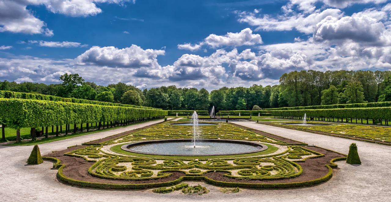
Is it possible to DIY landscape design? This is a question that many homeowners have, especially after seeing the price of design services.
Certainly, there is a steep learning curve and a ton of work involved. But if the homeowner is willing to take on the task, a DIY landscape for beginners is definitely possible.
To get started, here are the most important DIY landscape design essentials and simple landscaping design ideas!
Unity of Design
Unity in a DIY landscape design is perhaps the most difficult thing to achieve — but vital. All the elements in the design should be orderly and go together. Generally, they work together to point the eye toward a focal point, such as a large water feature or tree.
Haphazardly placed elements compete with one another and make the viewer feel overwhelmed and unsettled. As a result, there is visual confusion and the landscape feels cluttered.
Lines and Outdoor Rooms
Lines help tie the different parts of a DIY landscape design together. Whether designing the front yard or the backyard, lines are a strong element that is a must.
It is possible to create lines with various elements. For example, walkways, the edges of flower beds or the lawn, a line of potted plants, or anything else that creates an actual or visual line.
Lines can also be used to define areas of the landscape — separating them into outdoor “rooms” that bring order to the space. Popular rooms are outdoor kitchens, patios for entertaining, fire pits with seating, and vegetable gardens.
Alternately, homeowners looking for a unique outdoor room addition will be limited only by their creativity. Garden labyrinths made of stone or pavement make a one-of-a-kind focal point. Or, consider designing a recreational space like a horseshoe pit or putting green.
Simplicity
Be careful about putting too many different elements into the landscape design. If a certain element is not needed to strengthen the design, don’t add it.
This is where so many homeowners give away their DIY landscape design secret — it was done by beginners. Too many elements end up competing with one another and making the scene feel cluttered. Instead of offering a peaceful oasis, the landscape demonstrates disharmony to the viewer.
Variety
That being said, it’s also possible to go too simple. Repeating elements (the same plant in a grouping) is a great way to keep things simple, but variety is important too.
For example, plant a repeating row of boxwoods along a walkway. The repetition creates simplicity. Then, place a taller, conical-shaped tree at the end of the walkway for variety.
Form and Shape
There are various forms or shapes that can be used in DIY landscaping for beginners. These include:
- Columnar: tall and skinny
- Oval: elongated with soft, rounded edges
- Weeping: like the classic weeping willow outline, place focal points under these trees as the eye will naturally travel downward
- Rounded: rounded like a shrub
- Pyramidal: triangular shape pointing upward, use sparingly as it draws the eye upward
Consider how these shapes will fit in with the rest of the landscape’s design. The right shapes can also direct the viewer’s attention to certain points.
Texture
As summer comes to a close, the flowers die off and take much of the landscape’s interesting features with them. How can homeowners keep their landscape design eye-catching during the winter months?
Pay attention to the textures. These include:
- Fine vs coarse
- Heavy vs light
- Thin vs dense
- Light vs shadow
Choose plants with leaves of varying colors and sizes to keep up the interest. And don’t forget to factor in the texture of the plants during winter dormancy.
Deciduous trees drop leaves every fall, but the branches left behind still contribute to the overall landscape aesthetic. Further, evergreen shrubs and trees are easy to visualize year-round because their appearance is constant.
Color
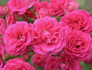
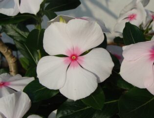
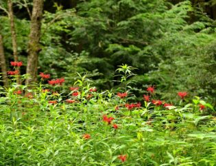
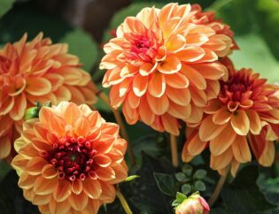
Color is a vitally important piece of landscape design. Cool colors like green, blue, and violet made the space feel more peaceful and relaxing. Warm colors like red, orange, and yellow brighten up the space, making it feel more cheerful and energetic.
Neither color scheme is bad, but homeowners should think carefully about the atmosphere they want to create.
Choosing a color scheme and sticking to it is also a great way to tie the whole design together. Of course, it can be overwhelming trying to choose colors. Fortunately, there’s a great tool for getting started: the color wheel.
Scale and Proportion
Another important element to consider is the proportion of the plants. Larger trees will make the house seem smaller whereas smaller trees will make it seem larger.
This concept of proportions affects every element of the design. Some homeowners may want a hardscape like a gazebo to be a focal point in their backyard. However, by placing a large tree right next to it, they inadvertently make the gazebo seem insignificant.
Commonly, small yards suffer from a lack of proportion. Planting small trees and shrubs leaves enough room to create layers that draw the eye and create a sense of spaciousness. On the other hand, too-large trees crowd the space and make things feel cramped.
Balance and Harmony
Harmony occurs when a space contains elements that work beside each other. There is a sense that the components naturally fit together, and the overall effect is pleasing to the eye.
Importantly, too much of a good thing produces a bland, boring landscape. Generally, nature does not produce forests in perfect little rows, which is why landscapes with perfectly even numbers and types of plants feel artificial.
Formal balance means lining up like elements on either side of the yard. Informal balance is more relaxed. While each side is not exactly mirroring the other, as a whole the scene still feels harmonious and balanced.
Emphasis and Focal Points
The human eye is adept at finding patterns. However, perfect, even patterns (like a checkerboard) fatigue and bore the viewer. What is the goal? Where is the destination?
Emphasis is needed as an antidote to overwhelming harmony. This is where the right focal point makes all the difference.
In landscaping, focal points take many forms. For instance, a brightly colored plant like a Japanese Maple is an option. Or, it may be a landscape berm that naturally draws attention. Further, structures including arbors, pergolas, or benches are great focal points.
Sequence
Sequencing is how the colors, forms, textures, or sizes change or flow from one to the next. The best way to flow through a garden is with gradual changes of one element at a time. Drastic changes, such as a spiny plant right next to a fine-textured fern feel too harsh and don’t flow well.
Keep this in mind when choosing colors, too. Be aware of dominant colors and take care not to overpower the scene. In general, a landscape should be 90% green and only about 10% brighter colors to achieve a palette found in nature.
Negative Space
All that being said, it’s important to know when to stop. Make sure to leave enough negative space in your design. An expanse of lawn, a rock garden, or other open areas in the landscape gives it space to breathe.
Too much stuff will make a DIY landscape design feel cluttered and can even make the viewer feel stressed instead of relaxed.
Complement the Home
Before getting carried away with the smaller details of design, don’t forget to consider the home on the lot before you. Are there architectural elements that are dated or strange? The right design will conceal or minimize these features. Does the home already have a defined style? Find the right type of landscape for your home here.
Got a Project in Mind?
Here at Atlanta Turf & Tree, we take immense pride in building beautiful, lasting landscapes that double as living art. We have over 35 years of combined experience in the industry and understand the challenges unique to Georgia landscapes. Contact our landscaping services experts to get going on your project!
